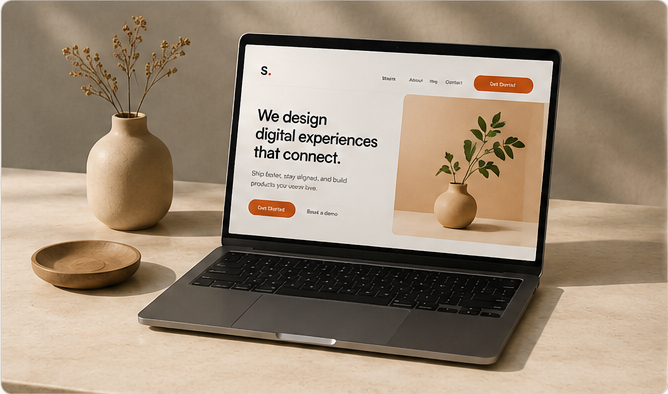
Simple design works because it removes confusion.
A simple website can look expensive when the visitor understands the page quickly. Strong spacing, readable type, clear sections, and good image placement make the site feel intentional.
Most pages do not need more decoration. They need better order. When the headline, copy, images, and buttons support one direction, the design feels more premium.
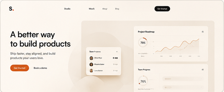 Large website content preview
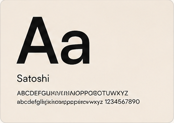 Typography detail
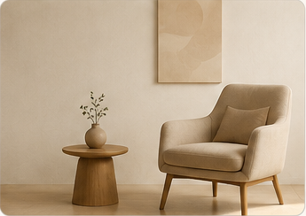 Clean section layout
Spacing and type create trust.
Visitors feel the difference when text has room to breathe. Headings should guide the eye, paragraphs should be easy to scan, and sections should not fight each other.
A polished page also needs responsive image boxes. Images should fit the frame, load cleanly, and support the message instead of stretching or breaking the layout.
Clear first screen
Say what the page is for before the visitor has to guess.
Strong section rhythm
Use repeatable spacing so the page feels calm and planned.
Real visual proof
Use images that show the offer, process, or final result clearly.
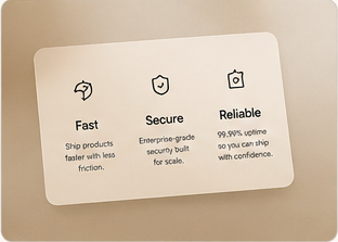 Feature UI detail
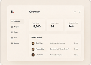 Final website polish
The final idea.
Before adding more, ask if the current page already feels clear, balanced, and easy to trust on phone and desktop.